University of Tennessee Athletics
UT ENHANCES BRAND ACROSS ALL ATHLETICS
July 01, 2015 | General

KNOXVILLE, Tenn. -- The Tennessee Athletics Division of Intercollegiate Athletics, in partnership with Nike, today introduced a new brand and identity system that sets the visual direction for Volunteers Athletics for years to come. The updated identity provides a timeless yet progressive look to one of the nations premier athletics programs of intercollegiate athletics.


Tennessee Athletics and Nike collaborated on a brand evolution program to create consistent marks across all athletics programs, honoring the Volunteer spirit through tradition, pride and integrity, key characteristics and attributes associated with the Volunteer brand. As Tennessee enters a new chapter in their storied history, developing a modern and consistent athletic identity that encompasses the pride of the university is key. Tennessee and Nike worked with student-athletes, coaches, administrators and alumni to pay tribute to Volunteer's legacy and tradition. As part of the refined brand identity, all 20 of Tennessee Athletics sports teams will showcase consistent colors, logos, lettering and numerals that will debut with the football programs and eventually expand across all sports in the upcoming seasons. The Lady Vols mark will remain the primary logo for Women's Basketball.

"It's extremely fitting that this partnership be formed," said University of Tennessee Vice Chancellor and Director of Athletics Dave Hart. "Nike excels as it relates to branding and marketing. Their level of expertise in that space is nationally renowned, Nike does that as well or better than anyone. We feel blessed to be aligned with Nike and are excited to form this tremendous partnership."

The Vision of Volunteer Athletics is to represent the University of Tennessee by developing student-athletes that honor the Volunteer spirit through key brand attributes such as tradition, history, community, excellence, integrity, pride and winning.
In an effort to create consistency across all applications that honors the past while attracting new audiences in an authentic and meaningful way, there will be a new primary logo that pays tribute to what Volunteer Athletics stands for. The Power T logo has stood as a primary icon for The University of Tennessee Athletics for over half a century. It signals a strong foundation that honors the tradition that has been built across decades of competition that creates distinction. The weight has been adjusted to maintain the powerful look and visual presence of the T, which will serve as the main identifying device for all programs.

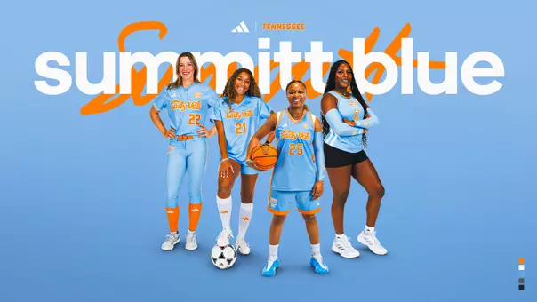
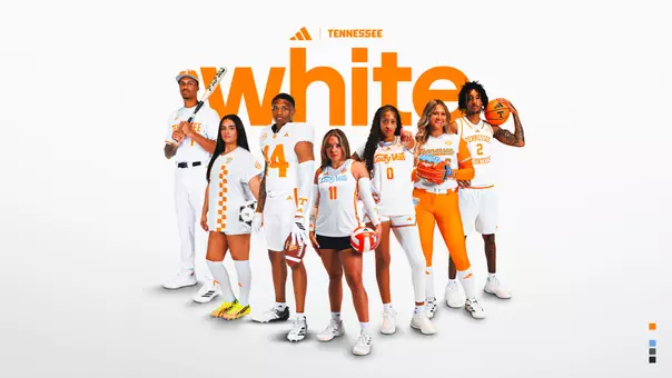
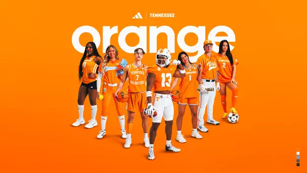
Tennessee Orange and white are the official colors of The University of Tennessee Athletics. Charles Moore, a member of the first football team in 1891, selected Tennessee's iconic colors, and they were later approved by a student body vote.
The Orange color is inspired by the common American daisy, which grew on the hill surrounding UT's most notable building, Ayres Hall. White represents confidence and honesty. The neutral palette of Smokey Grey and Anthracite references the tonal layers of The Great Smoky Mountains, one of the State of Tennessee's most iconic landmarks.

"It's an incredible honor to create a new identity that encompasses the Volunteer spirit," said Todd Van Horne, vice president and creative director for Nike Football and Baseball. "As we work with Tennessee Athletics on their next chapter, we wanted to incorporate a sleek yet powerful look to the iconic T ."

NEW TENNESSEE BRAND IDENTITY STANDARDS
Introduction of a refined primary logo, the "Power T" to be used consistently by all intercollegiate athletic teams.
Update to Checkerboard mark
Custom alphabet, logotypes and numeral set.
Primary and secondary color palettes.
PRIMARY IDENTITY--THE POWER T LOGO
The Power T logo has stood as a primary icon for The University of Tennessee Athletics for over half a century. It signals a strong foundation--honoring the tradition that has been built across decades of competition while creating distinction and reinforcing the brand for the next generation.
Doug Dickey introduced the iconic `Power T' that represents the Tennessee sports programs on its football helmets in 1964, Dickey's first year as head football coach, then re-designed by Johnny Majors when he became coach in 1977. Through this exercise, the primary mark has been standardized and adjustments to the geometry have been made to maintain consistent proportions and ensure visual impact. The weight has been adjusted to maintain the powerful look and visual presence of the T, which will serve as the main identifying device for all programs.
Reinforcement of the primary identity will build equity in the Tennessee Athletics brand. In primary or secondary colors, the Power T logo works well across all media. With a flexible approach to palettes and logo staging, the Power T logo is positioned to represent the University for years to come.
THE UNIVERSITY OF TENNESSEE ATHLETICS BRAND IDENTITY COLOR
COLOR PALETTE
When it comes to communicating the University of Tennessee Athletics brand, color is quintessential. The following color configurations show how The University of Tennessee's primary and secondary colors can be expanded analogously to build harmonious color palettes and complementary pairings.
Tennessee Orange and white are the official colors of The University of Tennessee Athletics. Charles Moore, a member of the first football team in 1891, selected Tennessee's iconic colors, and they were later approved by a student body vote.
The Orange color is inspired by the common American daisy, which grew on the hill surrounding UT's most notable building, Ayres Hall. White represents confidence and honesty. The neutral palette of Smokey Grey and Anthracite references the tonal layers of The Great Smoky Mountains, one of the State of Tennessee's most iconic landmarks.
At times, an opportunity arises to utilize an expanded color palette or colors outside of the core palette. This is typically seen in the occasional use of a unique uniform, like those that support special initiatives such as breast cancer or honoring public service members. Utilizing colors outside of the primary color palette is encouraged for special occasions; however, it is not intended for long-term use. Color also plays a critical role in the retail environment. Retail brand expressions should have seasonal core palette flexibility, and when used correctly will complement the primary color palette appearing on the field of play.
THE UNIVERSITY OF TENNESSEE ATHLETICS BRAND IDENTITY TYPOGRAPHY
TYPOGRAPHY--PRIMARY--WORDMARKS
The custom wordmarks are bold graphic treatments that create a clear, consistent, and visually memorable identity. The Tennessee, Volunteers, Vols and Rocky Top wordmarks capture the essence of the brand.
As the state's land grant university, Tennessee draws its nickname, Volunteers, from the name most associated with the state. Tennessee acquired the name "The Volunteer State" during the War of 1812, when General Andrew Jackson, at the request of President James Madison, mustered 1,500 men from his home state to fight at the Battle of New Orleans.
The name became even more prominent in the Mexican War when Governor Aaron V. Brown issued a call for 2,800 men to battle Santa Ana and some 30,000 Tennesseans volunteered. Tennessee's color guard still wears dragoon uniforms of that era at all athletic events.
The term "Volunteer State," as noted through these two events, recognizes the long-standing tradition of Tennesseans to go above and beyond the call of duty when their country calls. The name "Volunteers" is often shortened to "Vols" in describing Tennessee's athletic teams.
As one of the nation's oldest collegiate bands, our Pride of the Southland Marching Band delivers the spirited soundtrack for campus life and our most beloved traditions. The band began with thirteen members right after the Civil War, when the university reopened. Since then, the band has grown to more than 300 talented musicians. The band has made the song "Rocky Top" famous, and the phrase has become a rallying cry for Volunteer supporters worldwide.
The wordmarks work closely in support of the primary identity, and the shape of the state of Tennessee inspires the letterforms. The customized ligatures and nuances of the letterforms create a powerful, exclusive look that distinguishes the wordmarks from other institutions.
TYPOGRAPHY--SECONDARY
The secondary sans-serif typeface Gotham was selected to complement the primary typeface and directly tie back to the university identity. Gotham is part of a family that offers a range of weights, providing great versatility and legibility in print and electronic applications. The counters are open, even in the bold and bold condensed weights, further contributing to legibility. It may be used as headline and body copy for athletic department marketing materials and support verbiage (i.e., specific sport marks, event tickets, brochures, etc.).
TYPOGRAPHY--SPORT-SPECIFIC--LOCKUP
Sport-specific wordmarks supply freshness and uniqueness to products when needed as well as represent specific university athletics programs. They unify athletics and promote consistency across the brand by sharing a common visual language and hierarchy. Each sport benefits from identification as part of Tennessee Athletics and assists in building the core brand while communicating the diversity of the athletics program.
TYPOGRAPHY-- LADY VOLUNTEERS
The formation of the Women's Intercollegiate Athletics Department for the 1976-1977 academic years prompted much discussion concerning the proper nickname for women's teams. After long consideration and debate, it was decided the female student-athletes would be known as "Lady Volunteers," or simply the "Lady Vols." The name "Volunteers" or "Lady Volunteers" is often shortened to "Vols" or "Lady Vols" when describing Tennessee's athletic teams. In honor of their storied history, the Women's Basketball team will maintain this identity exclusively going forward.
TYPOGRAPHY-- LADY VOLUNTEERS
CHECKERBOARD
One of the biggest and most popular trademarks and most recognizable sights about Tennessee sports is the orange and white checkerboard end zones that were introduced in the 1960s and continue to appear today. Inspired by the checkerboard design of the outside brickwork on Ayres Hall, the pattern can also be found on the basketball court in Thompson-Boling Arena.
The checkerboard has been standardized as a four-row pattern to represent the way it appears in the football end zones.
ONE TENNESSEE
The One Tennessee mark seeks to elevate athletics while leveraging the most visible and successful programs past and present. The state silhouette flooded with checkerboard becomes instantly recognizable and iconic. When the Vols take the field, they represent the entire state of Tennessee and all of the values that the state embodies. A mark inspired by these attributes will serve as a badge of honor that is validated on the field of play and extends into the global network of Volunteer supporters.